Est. London MMXXVI

Functional Beauty for the digital Interface.

Pixelhatch is a boutique design studio in Old Street. We build high-performance web environments that bridge the gap between technical precision and Scandinavian hygge.

Beyond the Template.

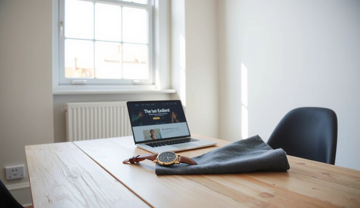
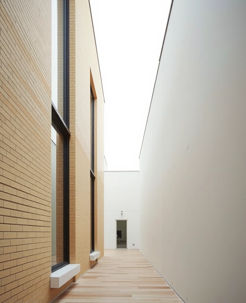
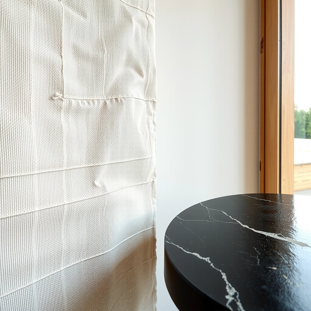
In the landscape of modern web design, true authority is earned through clarity. We reject the flurry of flashy distractions in favor of a "Scandinavian Cabin" philosophy—grounded in blond wood, wool textures, and functional minimalism. For a London business, your digital presence is more than a storefront; it is a structural representation of your internal standards.

We translate tactile brand elements into fluid, responsive web experiences. By focusing on a clean codebase and intentional typography, we ensure your site grows alongside your company. This is sustainable digital scaling: avoiding the total rebuild cycle every two years by building with architectural integrity from the first line of code.

Studio Philosophy Material Board

Fig 01. Visualizing the interplay of physical textures and digital precision.

The Design Ledger

Audit of Digital Craftsmanship

Grid Rationality 12-Col / 32px Gutter
Typography Stack Instrument Serif / Inter
Min. Delivery Cycle 08 — 12 Weeks
Interaction Model Static-First Editorial
Base Performance 95+ Lighthouse Target
Standard Compliance WCAG 2.1 Level AA

Signed: Pixelhatch

Old St. Studio No. 35-39

London architectural inspiration
London Studio Context — Shoreditch / Old St. Corridor

Built for Authority.

We believe that luxury is the absence of noise. Every pixel is a choice between clarity and clutter. For high-end London property developers and boutique hoteliers, this means building an interface that feels as permanent and considered as a physical structure.

Material Juxtaposition
"Digital craftsmanship is the quiet refusal
to accept the default."
Aesthetic Honesty Technical Depth London Precision

Navigating Constraints.

Every project at Pixelhatch begins with an honest evaluation of trade-offs. We prioritize quality over speed and bespoke code over the convenience of generic builders.

The Speed Metric

Loading times are the first impression. We optimize for sub-second interactions because a slow site signals a lack of care.

Criterion 01
Accessibility vs. Art

Inclusive design is a fundamental requirement. We ensure high-contrast ratios and screen-reader compatibility without sacrificing the high-end editorial aesthetic our clients expect.

Criterion 02
Custom vs. Template

Templates are rigid; they fail as your business pivots. Our bespoke approach uses atomic design systems that allow for modular growth and unique visual identity.

Criterion 03
Typography vs. Noise

We select fonts that signal expertise. Hierarchy is our primary tool for guiding users through a logical, persuasive journey without the need for aggressive UI elements.

Criterion 04
Mobile vs. Desktop

The handheld experience is the primary touchpoint for UK consumers. We design from the palm up, ensuring your brand stays tactile on glass.

Ready to build?

Start the Conversation.

Physical Location

35-39 Old St, London EC1V 9HX
United Kingdom

Direct Dial

+44 20 7253 3500
[email protected]

Working Hours

Mon-Fri: 09:00-18:00 GMT
By Appointment Only